Create a chart
1
Navigate to Charts
Navigate to Flows > Charts.
2
Create a new chart
Select + New chart to start a new chart. To build on an existing chart, select ⋮ to the right of the chart > Duplicate. ➀ Toolbar — hover over each tool to see a description. Use the Slider to view or compare time series values.➁ Open in… — download, duplicate, delete, or open the chart in Canvas.➂ Add data — add a time series, or import or create a calculation.➃ Agents — open an AI agent to work with the chart.➄ Sidebar — set up alerting, monitoring, thresholds, or data profiling. Add events and activities.
Use an agent to find and analyze data

To interact with an agent, you need these capabilities.Learn more about Atlas AI.
Add a time series
To add a time series to your chart:1
Open Add time series
Select Add data > Add time series.
2
Select and add time series
Find and select the time series > Add.For each time series and calculation, explore the different ways to set units and fine-tune the data display. For example, try to adjust the thickness and color of the diagram line. Click for more details.
Add a calculation
To add a calculation:1
Create a calculation
Select Add data > Create calculation.
2
Add input sources
Select Add node or right-click in the panel below the chart to add input sources.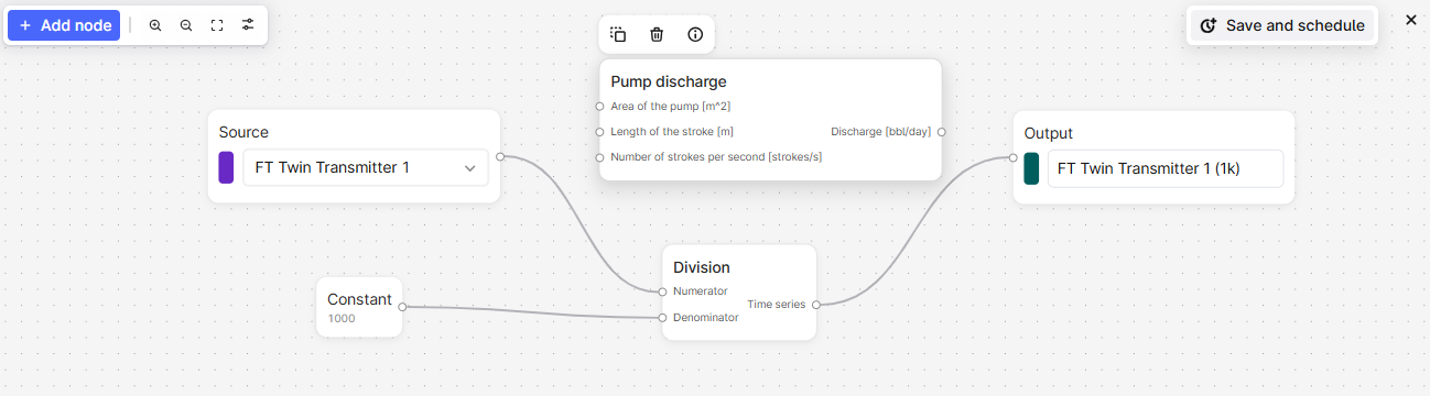
3
Add constants or functions
Right-click the panel to add constants or functions to the calculation. Select to view the function details or hover over the parameters for more information.
4
Configure output
Pipe the calculations in order and include the final output node to display the result on the chart plot.
Use one calculation as input to another to view the output from each step.
Schedule a calculation
Schedule a calculation and save the result as a time series. You can also monitor the calculation.1
Save and schedule
Add a calculation and select Save and Schedule.
2
Specify credentials
Specify the sign-in credentials for the schedule, and click Next. If you don’t know the credentials, contact your CDF admin.
3
Configure schedule settings
Give the schedule a name and specify the necessary settings.
4
Start the schedule
Select Start schedule.
Trend data
To stack, overlay, and compare trends for time series, click+drag or hover+scroll to adjust and move each diagram axis. Use the Slider on the toolbar to view or compare time series values at a specific time.View and assess data quality
A chart line is shaded if the data quality of a time series is Uncertain and has a gap if the quality is Bad. Use data profiling to assess the quality of a time series and whether it fits your purpose. Data profiling uses the Industrial Data Science Library (InDSL) to define gaps if the time deltas deviate by more than 1.5 times the interquartile range.1
Open Data profiling
In the chart, select Data profiling. Select the time series you want to assess in the Source dropdown list.
2
View quality metrics
Switch between viewing a boxplot and a histogram of time deltas or density.
Set thresholds for historical data
To set thresholds for historical data:1
Open Thresholds
On the top right of the chart, select the Threshold icon.
2
Configure threshold values
In the panel, set the threshold values for time series and calculations.
Add events
You can add events, such as a faulty shutdown, to help analyze time series. To add events to a chart:1
Open Events
Select Events from the sidebar.
2
Configure event filters
Add or select a filter to specify the events to add.
Add activities
Activities in Cognite Data Fusion (CDF) represent tasks, events, or operations that happen over a period of time in your industrial environment. They provide a structured way to track work, maintenance, inspections, and other time-based activities, connecting planned and executed work with your physical assets and operational data. Turn on Activity to visualize and contextualize time series data with these operational events in your chart. Activities appear as vertical bars in the chart, providing visual reference to help you correlate time series behavior with relevant operational activities such as maintenance work, inspections, or production events.Prerequisites
Before you add activities to a chart, ensure that:- The relevant data is modeled as activities or extended activities in your CDF project.
- You have time series
readaccess rights to view Charts and the relevant data.
1
Add time series
Select + Add data > Add time series. Search and select the time series you want to visualize.
2
Select activities
In the Category dropdown, select Activity, and then select the activities you want to visualize.
Once selected, the Activity layer will turn on automatically.
The Asset filter applies automatically based on the time series the assets belong to in the chart. You can clear or add filters based on your preferences.
1
View activity details
Click an activity bar to view details such as start and end times, a description, and the asset the activity is tied to. Click View details to see full information about the activity.
2
Pin an activity
Click the pin icon to keep the activity highlighted while you compare it with other activities.
Monitor time series
Time series monitoring jobs send emails for any breaches to the thresholds you set. If there are several breaches within the minimum duration period, you’ll only receive one email for the period. We recommend that you set a minimum duration of 5 minutes to limit the number of email alerts you receive. The minimum expected data point frequency is 1 minute. If the data points have a lower frequency, alerts may not trigger as expected.Create monitoring jobs
1
Open Monitoring
Select Monitoring > Create from the sidebar.
2
Name the job
Give the monitoring job a name.
3
Select a source
Select the time series or calculation you want to monitor in the Source dropdown.
4
Set threshold and duration
Specify the threshold and minimum duration for the alert.
5
Specify storage folder
Specify the folder to store the alerts in.
6
Select recipients
Select the users who’ll receive the email alerts.
7
Optional. Configure advanced options
Open Advanced options and specify the sign-in credentials for the monitoring job.
8
Start monitoring
Select Start monitoring.
Subscribe to alerts
To subscribe to an alert:1
Open Monitoring
Select Monitoring from the sidebar.
2
Subscribe to alert
Find the alert you want to subscribe to and select .
Resolve alerts
To resolve an alert you’ve investigated:1
Open alert history
Select the alert > History.
2
Mark as resolved
Select Active > Mark as resolved.