Charts
I arbeidsområdet Industrial tools kan du bruke Charts til å analysere tidsserier.
Opprette et diagram
Slik oppretter du et diagram:
-
Gå til Industrial tools > Charts .
-
Velg + New chart for å starte et nytt diagram. Hvis du vil videreutvikle et eksisterende diagram, velger du … -> Duplicate.

➀ Verktøylinje: Hold musepekeren over hvert verktøy for å se en beskrivelse. Bruk glidebryteren for å vise eller sammenligne tidsserieverdier.
➁ Open in …: last ned, dupliser, slett eller åpne diagrammet i Canvas.
➂ Add data: legg til en tidsserieeller importer eller opprett en beregning.
➃ Agenter: åpne en AI agent for å jobbe med diagrammet.
➄ Sidestolpe: konfigurer varsler, overvåking, grenseverdier eller dataprofilering. Legg til hendelser.
Legge til en tidsserie
Slik legger du til en tidsserie i diagrammet:
-
Velg Add data > Add time series.
-
Finn og velg tidsserien > Add.
For hver tidsserie og beregning kan du utforske de ulike måten å angi enheter og finjustere datavisningen på. Du kan for eksempel prøve å justere tykkelsen og fargen på diagramlinjen. Bruk 🛈-knappen til å vise flere detaljer.
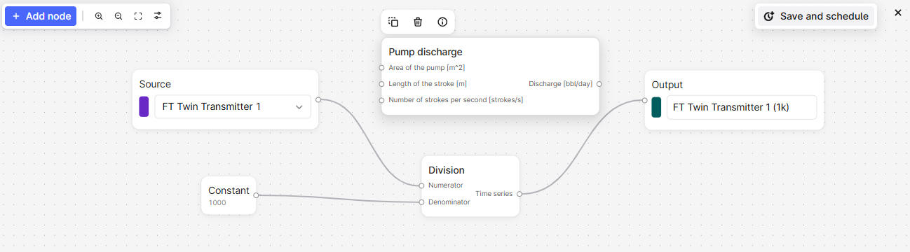
Legge til en beregning
Slik legger du til en beregning:
-
Velg Add data > Create calculation.
-
Velg Add node, eller høyreklikk i panelet under diagrammet for å legge til inndatakilder.
-
Høyreklikk på panelet for å legge til konstanter eller funksjoner i beregningen. Velg 🛈 for å vise funksjonsdetaljene, eller hold musepekeren over parameterne for å få mer informasjon.
-
Legg inn beregningene i riktig rekkefølge, og ta med den siste utdata-noden for å vise resultatet på diagramplottet.
Bruk én beregning som inndata i en annen beregning for å vise resultatet fra hvert trinn.
Planlegge en beregning
Planlegg en beregning, og lagre resultatet som en tidsserie. Du kan også overvåke beregningen.
-
Legg til en beregning, og velg Lagre og Planlegg.
-
Angi påloggingsinformasjonen for tidsplanen, og klikk på Neste. Hvis du ikke har påloggingsinformasjonen, kontakter du CDF-administratoren din.
-
Gi tidsplanen et navn, og angi nødvendige innstillinger.
-
Velg Start schedule.
Trendanalysere data
Hvis du vil stable, overlegge og sammenligne trender for tidsserier, kan du klikk + dra eller holde musepekeren over + rulle for å justere og flytte hver diagramakse.
Bruk glidebryteren på verktøylinjen for å vise eller sammenligne tidsserieverdier på et bestemt tidspunkt.
Vise og vurdere datakvalitet
En diagramlinje blir skyggelagt hvis datakvaliteten på en tidsserie er Uncertain, og den har et hull hvis kvaliteten er Bad.
Bruk dataprofilering for å vurdere kvaliteten på en tidsserie og om den passer til formålet. Dataprofilering bruker verdiene i Industrial Data Science Library (InDSL) til å definere hull hvis tidsdeltaene avviker med mer enn 1,5 ganger det interkvartile området.
-
I diagrammet velger du Data profiling. Velg tidsserien du vil vurdere, i rullegardinlisten Source.
-
Veksle mellom visning av et boksplott og et histogram med tidsdeltaer eller tetthet.
Angi grenseverdier for historiske data
Slik angir du grenseverdier for historiske data:
-
I diagrammet velger du Thresholds (
 ).
). -
I panelet angir du grenseverdiene for tidsserier og beregninger.
Legge til hendelser
Du kan legge til hendelser, for eksempel en defekt avstengning, for å bidra til å analysere tidsserier.
Slik legger du til hendelser i et diagram:
-
Velg Events fra sidestolpen.
-
Legg til eller velg et filter for å angi hendelsene du vil legge til.
Overvåke tidsserier
Tidsserieovervåkingsjobber sender e-poster for eventuelle brudd på grenseverdiene du har angitt. Hvis det er flere brudd innenfor minstevarighetsperioden, vil du bare motta én e-post for perioden.
Vi anbefaler at du angir en minstevarighet på 5 minutter for å begrense antallet e-postvarsler du mottar. Den minste forventede datapunktfrekvensen er 1 minutt. Hvis datapunktene har lavere frekvens, kan det hende at varsler ikke utløses som forventet.
Opprette overvåkingsjobber
-
Velg Monitoring > Create fra sidestolpen.
-
Gi overvåkingsjobben et navn.
-
Velg tidsserien eller beregningen du vil overvåke, i rullegardinlisten Source.
-
Angi terskelverdien og minstevarigheten for varselet.
-
Angi mappen du vil lagre varslene i.
-
Velg brukerne som skal motta e-postvarslene.
-
Valgfritt. Åpne Advanced options, og angi påloggingsinformasjonen for overvåkingsjobben.
-
Velg Start monitoring.
Abonnere på varsler
Slik abonnerer du på et varsel:
- Velg Monitoring fra sidestolpen.
- Finn varselet du vil abonnerer på, og velg 🔔.
Løse varsler
Slik løser du et varsel du har undersøkt:
-
Velg varselet > History.
-
Velg Active > Mark as resolved.
Dataaggregering
Hvis et diagram inneholder mer enn 100 000 datapunkter, oppsummeres datapunktene i Charts for å gjøre dataene enklere å vise. De aggregerte dataene skyggelegges og viser minimums- og maksimumsverdiene til det aggregerte dataverdiområdet. Zoom inn for å vise individuelle datapunkter.