Charts
In the Industrial tools workspace, use Charts to analyze time series.
Create a chart
To create a chart:
-
Navigate to Industrial tools > Charts.
-
Select + New chart to start a new chart. To build on an existing chart, select ... > Duplicate.

➀ Toolbar — hover over each tool to see a description. Use the Slider to view or compare time series values.
➁ Open in... — download, duplicate, delete, or open the chart in Canvas.
➂ Add data — add a time series, or import or create a calculation.
➃ Agents — open an AI agent to work with the chart.
➄ Sidebar — set up alerting, monitoring, thresholds, or data profiling. Add events.
Add a time series
To add a time series to your chart:
-
Select Add data > Add time series.
-
Find and select the time series > Add.
For each time series and calculation, explore the different ways to set units and fine-tune the data display. For example, try to adjust the thickness and color of the diagram line. Use the 🛈 button to see more details.
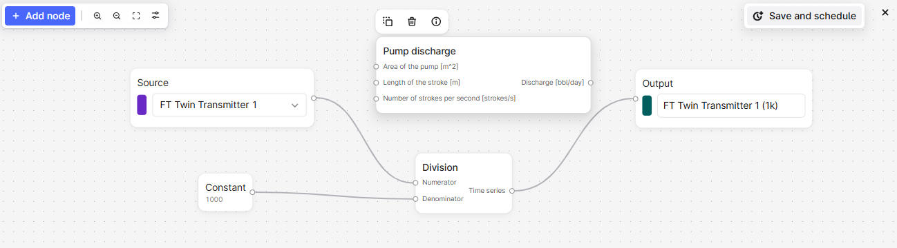
Add a calculation
To add a calculation:
-
Select Add data > Create calculation.
-
Select Add node or right-click in the panel below the chart to add input sources.
-
Right-click the panel to add constants or functions to the calculation. Select 🛈 to view the function details or hover over the parameters for more information.
-
Pipe the calculations in order and include the final output node to display the result on the chart plot.
Use one calculation as input to another to view the output from each step.
Schedule a calculation
Schedule a calculation and save the result as a time series. You can also monitor the calculation.
-
Add a calculation and select Save and Schedule.
-
Specify the sign-in credentials for the schedule, and click Next. If you don't know the credentials, contact your CDF admin.
-
Give the schedule a name and specify the necessary settings.
-
Select Start schedule.
Trend data
To stack, overlay, and compare trends for time series, click+drag or hover+scroll to adjust and move each diagram axis.
Use the Slider on the toolbar to view or compare time series values at a specific time.
View and assess data quality
A chart line is shaded if the data quality of a time series is Uncertain and has a gap if the quality is Bad.
Use data profiling to assess the quality of a time series and whether it fits your purpose. Data profiling uses the Industrial Data Science Library (InDSL) to define gaps if the time deltas deviate by more than 1.5 times the interquartile range.
-
In the chart, select Data profiling. Select the time series you want to assess in the Source dropdown list.
-
Switch between viewing a boxplot and a histogram of time deltas or density.
Set thresholds for historical data
To set thresholds for historical data:
-
In the chart, select Thresholds (
 ).
). -
In the panel, set the threshold values for time series and calculations.
Add events
You can add events, such as a faulty shutdown, to help analyze time series.
To add events to a chart:
-
Select Events from the sidebar.
-
Add or select a filter to specify the events to add.
Monitor time series
Time series monitoring jobs send emails for any breaches to the thresholds you set. If there are several breaches within the minimum duration period, you'll only receive one email for the period.
We recommend that you set a minimum duration of 5 minutes to limit the number of email alerts you receive. The minimum expected data point frequency is 1 minute. If the data points have a lower frequency, alerts may not trigger as expected.
Create monitoring jobs
-
Select Monitoring > Create from the sidebar.
-
Give the monitoring job a name.
-
Select the time series or calculation you want to monitor in the Source dropdown.
-
Specify the threshold and minimum duration for the alert.
-
Specify the folder to store the alerts in.
-
Select the users who'll receive the email alerts.
-
Optional. Open Advanced options and specify the sign-in credentials for the monitoring job.
-
Select Start monitoring.
Subscribe to alerts
To subscribe to an alert:
- Select Monitoring from the sidebar.
- Find the alert you want to subscribe to and select 🔔.
Resolve alerts
To resolve an alert you've investigated:
-
Select the alert > History.
-
Select Active > Mark as resolved.
Data aggregation
If a chart contains more than 100,000 data points, Charts summarizes the data points to make the data easier to view. The aggregated data is shaded and shows the minimum and maximum values of the aggregated data range. Zoom in to view individual data points.